GREEN — NATURES CRADLE: The Value of Neutrality in Japanese Garden Design
Landscapes, essentially landscape gardens of the west, focus on a result that stimulates the mind to respond either positively or negatively. The Japanese garden is intended to benefit people by introducing a third neutralizing element to the positive~negative of Fight or Flight, the colour green. Green engages the response of ‘idling’ — ‘neutrality’. While green is not a necessity of a Japanese garden, without the deep shades of green, Japanese garden landscapes can not push the emotional buttons needed to create specific responsive benefits in people. Colour is part of the information people need for the feeling of ‘safe or not safe’ even as a basis for happy, or sad. Shape, tells us where we are — home/not home, stimulated/relaxed; answering how we should respond in combination with colour for safety or the lack of safety.
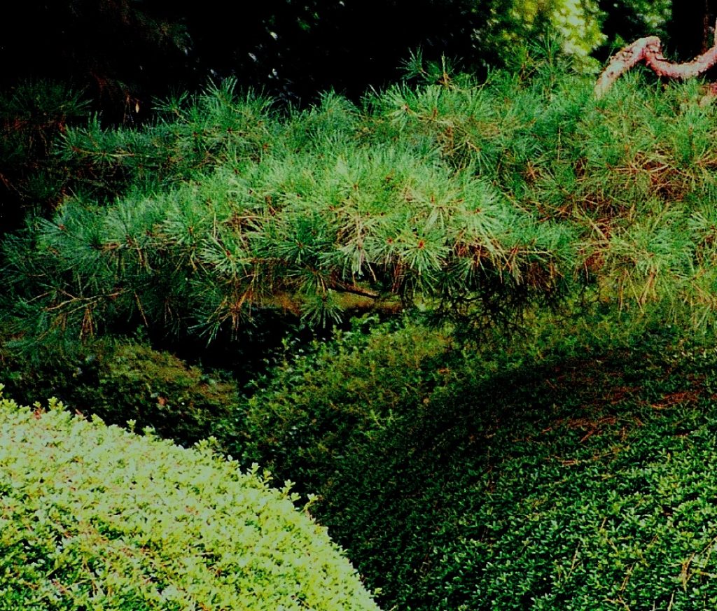
ESTABLISHING SAFE NEUTRALITY:
Plant colour selection in a garden, ‘that which is green’, be it moss, or leaves & needles, and where the location of colour changes are used in a design, causes a positive or negative reaction to the brain, stimulating a higher or lower activity rate. In places combining plant material using a colour just above the soothing ‘neutral’ threshold of human reaction, causes correlating reactions between coloured plants positioned on a green background, for example, drawing attention to the action of koi flickering in the light in a dark watery background.

“MEDITATION WITH YOUR EYES WIDE OPEN”:
— similar to ‘waiting to engage’, is an excellent way of understanding Japanese gardens and seems forgotten when constructing gardens in the west. In the context of Western/Eastern, the West creates shade, — planting to create the protective shade of the oasis, and the East, removes and prunes trees, opening canopies trying to create rays of light deep in the jungle forest.
In the context of ‘eyes wide open’ meditation, eastern Japanese gardens keep the pupils dilated with a sense of shaded comfort, —an open expression that induces internalization and the wonderment as a sense of shaded protective safety, rather than glaring exposure to sunlight.
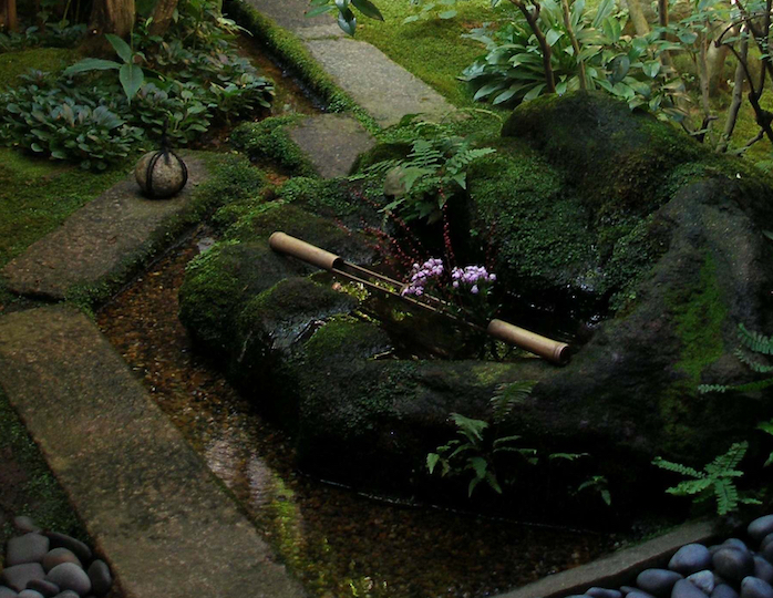
GREEN, THE THIRD ELEMENT, ACTUATES CHEMICAL CHANGES IN THE BODY:
On a subtle subconscious lower-level below mindfulness — adding specific details in the design and layout can also stimulate or de-stimulate a persons mind. Green, the Third-Element, causes a shift of chemicals, a dropping of stressors, the ‘bands of resistance’ across the shoulders. A persons posture unfolds to open breathing, and the brain actuates changes in the chemical composition of our saliva creating a state of inner receptive harmony.
This neutral ‘idling status’ in the mind of the person* experiencing the garden as a ‘resting moment’ enables other colours to create a mindful awareness that translates as ‘waiting to engage’. *(experiencer-player-participant) The analogy is not a mistake as Game Designers create staged arenas with shaded muted tones toggled to greens to lull a player and induce ‘restful waiting’.

SOUND — ADDITIONAL MARKERS OF SAFETY:
The deeper green tones are the epitome of the perfect ‘away space’, the comfort being visual, akin to the auditory ‘safety comfort’ of the rise and fall of cricket song — that interrupted – like the cricket floorboard, heralds an intrusion, jarring the senses awake in ‘Fight or Flight’ mode. Garden is after all, a place of comfort — and safety.
A similar example in former Kyoto would be the safeness of sleep inducing cicada rhythms at night, that — once a person is attuned to, manifests as the sound of insects comprising a symphony. Or, a cat. Purring from cats does the same thing.
An example of the depth of this green is the shade of the manicured entry to the Nitobe Memorial Gardens. (Originally created by Junji Shinada).
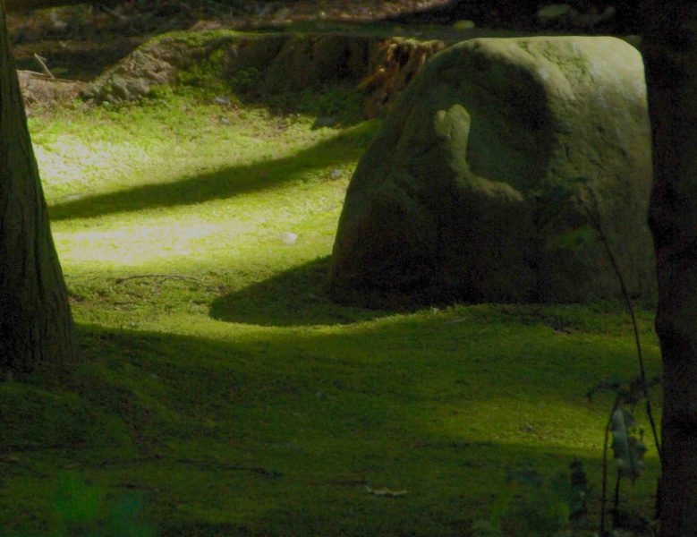
THE FEELING OF EMERGENCE:
A green so deep, that in the garden dialogue the womb is successfully represented, and it is no surprise in the garden dialogue that the place of your birth, the moment of brighter light is at the Shinto Kasuga lantern, and at every solstice, the lightbox is lit by a ray of light in celebration.
Sheltered, sequestered, nurtured with reflected light that dilates the pupils, as warming as a mothers hug, such a colour swing, deep to bright, brings the sensation of emerging, being birthed from the collective intangible womb into the light of the world.
By example a designed emergence to a place in public and thereby leaving a secluded space, or simply signalling a contrast to disturb the brain by sending a wake-up message for the next experience.
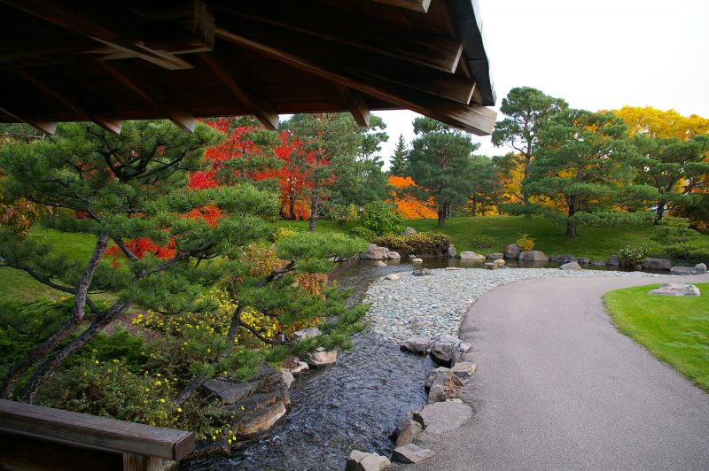
This effect, sets the garden stage so that other experiences, the dialogue creators of the successful Japanese garden stage to become actors/speakers** that are encouraged to engage, with the player/experiencer. **(colours, light/shade, movement, pattern, shapes)
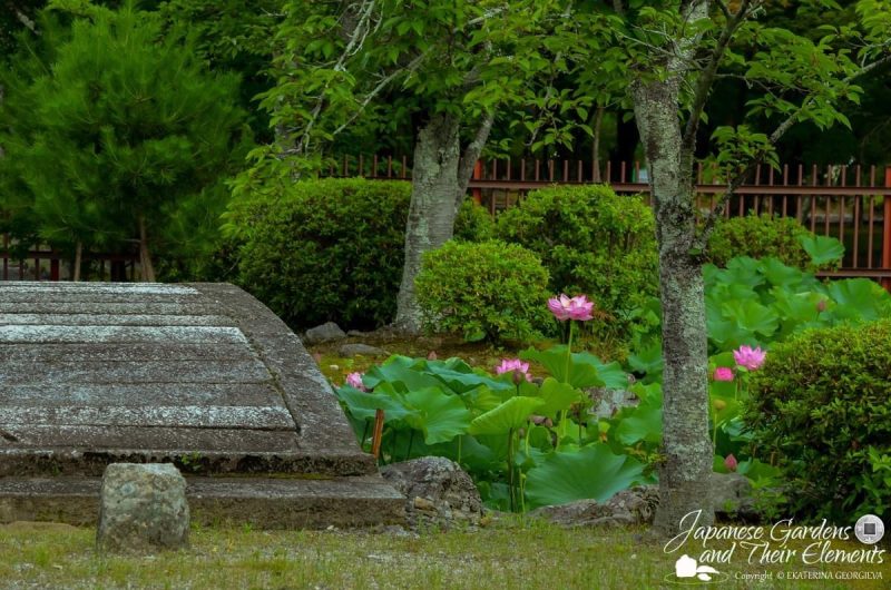
SADNESS, IS CAUSED BY AN ABSENCE OF COLOUR:
This is not surprising, as green is a ‘light based’ primary colour, from which the RGB colour codex is applied, as compared to the old pigment oriented* primaries. *(Pigment Primaries or Light Secondaries)
When the deep green shifts along the colour axis into the blue to yellow spectrum, the serotonin feel-good drug of the bright fresh ‘midori’ spring leaf colour causes a sense of happiness and ‘regrowth’ to flood the brain. An absence of the blue/yellow axis (green) causes sadness. As a colour causing stimulation, adding the ‘feel-good yellower tones’ would be a signal that shows the way to an entry, or by highlighting a pathway, marking a place of greater awareness.

PREPARING A “REQUEST TO ENGAGE” — PINK:
This calming ‘Third-Element’ comprises of 2 parts, the first is deep shaded green enabling rest. The second part is a muted rich pink tone that adds a ‘loading data’ response.
Combined, the deep green and muted pink tones simply allow the pupils to dilate, deeply exhaling, shoulders relaxing, being soothed in the comfort of those physical responses.
Even to the extent that the nature of the ‘pointy objects’ become calming.
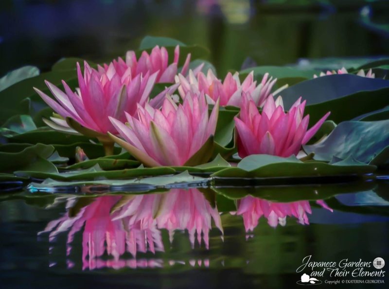
Separately, each colour demands nothing, nor does either send positive or negative stimulation to the brain. Together however, they create a soft inquiry, or “there it is” moment. Rather like trees that have a ‘rest’ period after dormancy, they cycle through rest, to a ‘waiting to engage’ for spring, refreshed and ready to grow. For early man’s hard-wiring, the combining of the green with pink changes ‘waiting’ to ‘inducing’ the universal “Request to Engage”.
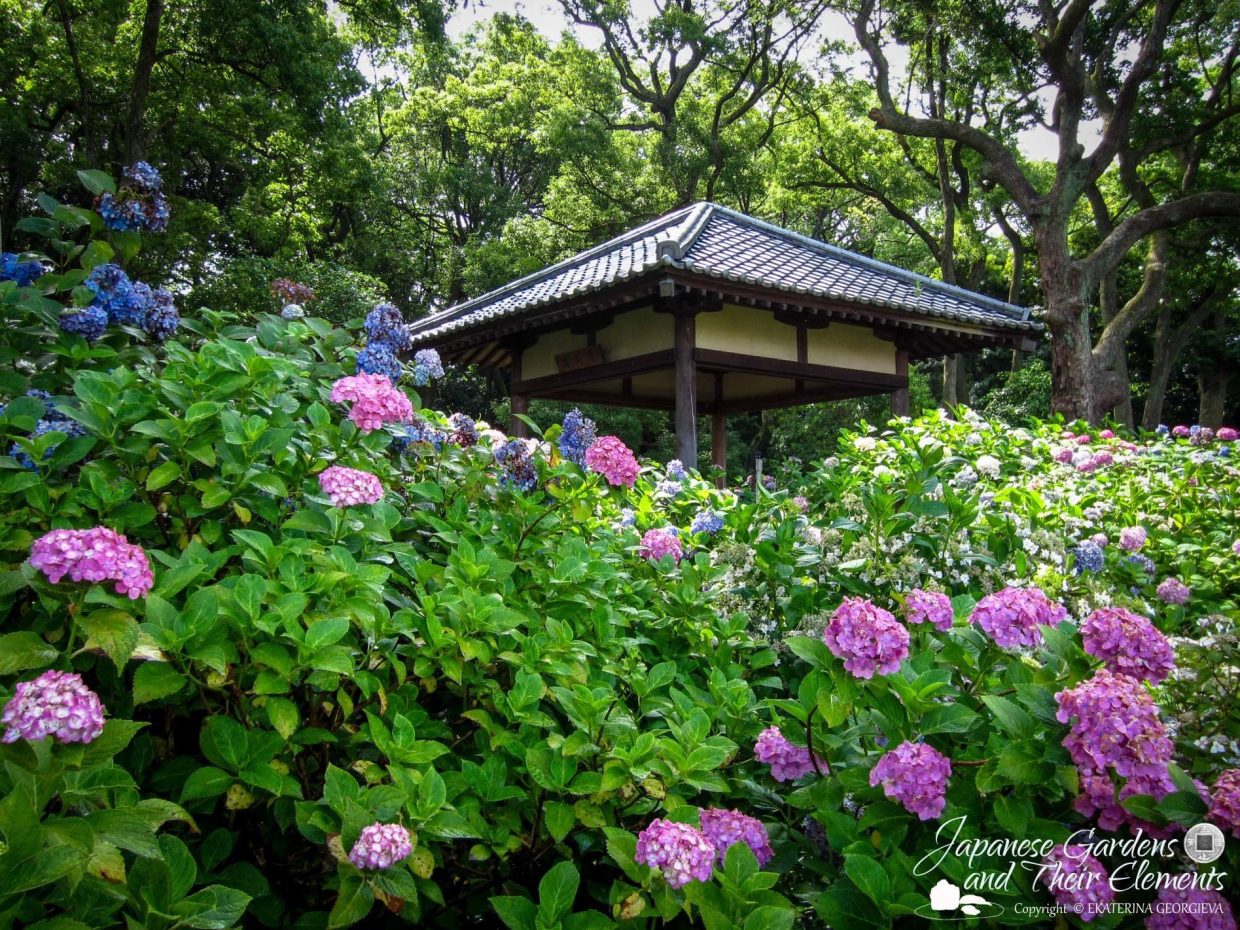
The mysteriously muted shade of pink is commonly found only in lotus, a rose, a few azaleas, certain varieties of cherries, a few plums, and a modest select few other ground-hugging flowering species, such as the Indian Paint Brush. It is no wonder that some cherry flowers and plums cause past memory to reawaken in a soft vulnerable regard.
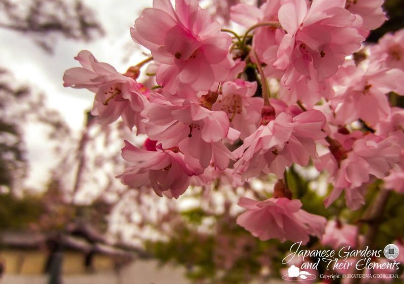
There is a particular richness, a sense of being drawn to pigments that carry brown earthier tonal qualities that in turn inspire a need to reach out and touch.
CREATING ADVERSITY:
Most shades of pink, veer to the yellower red spectrum. Causing an increasing of the pupils to harden, pinpoint, tighten, as the shifting green yellow to red yellow colour axis creates the elevated feeling signalling the danger trigger of ‘Fight or Flight’, the beginning of becoming adversarial.

Can there be too much green in the Japanese garden or any garden for that matter? Not really, in my experience. Or the small amount of happy that muted pink brings to the satisfaction of remembering, or poignantly sitting beneath in memory.
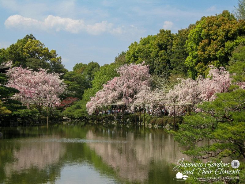
The benefits of being the stabilizing background green, the back-drop, as well as the key motivator for stimulating the chemicals needed for feeling good; for moving people, while finding place, feeling relaxation, as well as grounding and being grounded, when both are used in design, is a power to be tapped and accessed.
Garden Landscape Design Notes:
Author: Edzard Teubert | Fuzei + Tree: Responsive Landscape UX, Smart Trees : Smarter Landscapes
photo credit where noted to Ekaterina Georgieva of
Japanese Gardens & Their Elements / LITTLE KYOTO GARDEN CHIcago
This is top-notch!
This is stunning!
Your writing style is always so effective and engaging—great job!
So good
Great work
This article provides a lot of valuable information—well done!